How to Build a Blog Analytics Dashboard That Actually Guides Content Decisions
Step-by-step process to set up a simple but powerful reporting view for traffic, rankings, and conversions from your AI-driven blog.

Step-by-step process to set up a simple but powerful reporting view for traffic, rankings, and conversions from your AI-driven blog.
Pranjal Jain
If you’re publishing AI-generated articles every week but still guessing which posts drive real pipeline, the missing piece is a focused blog analytics dashboard.
Most teams drown in Google Analytics reports, exports, and random Looker Studio charts. What you actually need is a simple, opinionated view that tells you: which posts to double down on, which to update, and which topics to kill.
This tutorial walks you step by step through building a blog analytics dashboard that does exactly that: connects traffic, rankings, and conversions so your content decisions are data-backed, not vibes-based. We’ll focus on a setup that works whether you publish manually or through an AI blogging platform like Supablog.
If you want to go deeper into how to interpret what this dashboard tells you, pair it with our guide to AI blog content analytics so you can turn insights into compounding traffic wins.

Before you open any tools, decide what “success” looks like for your dashboard. A good content performance dashboard should answer, at a glance:
Which posts are bringing in the most qualified traffic?
Which topics and keywords are trending up or down in search?
Which posts are generating leads, trials, or revenue-related actions?
Where are the easiest wins for updates, internal links, or new content?
For a mid-funnel audience, your dashboard should be opinionated, not exhaustive. That means prioritizing actionable metrics over vanity stats like overall pageviews.
Design your blog analytics dashboard around these four questions:
Visibility: Are our key topics and posts gaining or losing visibility in search?
Engagement: Do visitors actually read and engage with our content?
Conversion: Which posts move people to sign up, subscribe, or book a demo?
Momentum: Which posts are compounding (growing month over month) vs stagnating?
We’ll map each of these questions to specific metrics and tiles in your dashboard below.
A powerful blog analytics dashboard doesn’t require an enterprise stack. You can get 90% of the value with:
Google Analytics 4 (GA4): for traffic, engagement, and conversions.
Google Search Console (GSC): for impressions, clicks, and keyword rankings.
Your CRM or product analytics: for pipeline and revenue attribution when available.
A visualization layer: Google Looker Studio, a BI tool, or a built-in analytics view like Supablog’s blog performance analytics.
If you’re using Supablog, you already get an integrated SEO reporting dashboard that pulls in traffic, rankings, and basic conversions per article. You can still layer GA4 and GSC on top for more granular analysis.
Make sure GA4 and GSC are properly configured before you move on. If they’re not, follow Google’s official setup guides for Google Analytics 4 for websites and Google Search Console for your domain.
Next, decide which metrics earn a permanent spot on your dashboard. For a blog that drives leads and trials, group metrics into four buckets.
Impressions: how often your pages appear in search results.
Clicks: how many people actually visit from search.
Average position: rough ranking for key pages or queries.
CTR (click-through rate): clicks ÷ impressions for each post or query.
These tell you whether your SEO efforts are putting you in front of the right audience.
Sessions per post
Average engagement time (or time on page)
Scroll depth (if implemented)
Bounce or engagement rate
These show whether visitors are actually consuming the content, not just landing and leaving.
Primary conversion rate per post (e.g., demo request, trial signup, lead form)
Micro-conversions (newsletter signup, content download, add to cart)
Assisted conversions where the blog page was part of the journey
This is where your dashboard becomes a real content marketing reporting tool instead of a traffic vanity board.
Month-over-month traffic change per post
Change in average position for target keywords
New vs returning users to blog content
Momentum helps you prioritize which posts need optimization now versus those you can let ride.
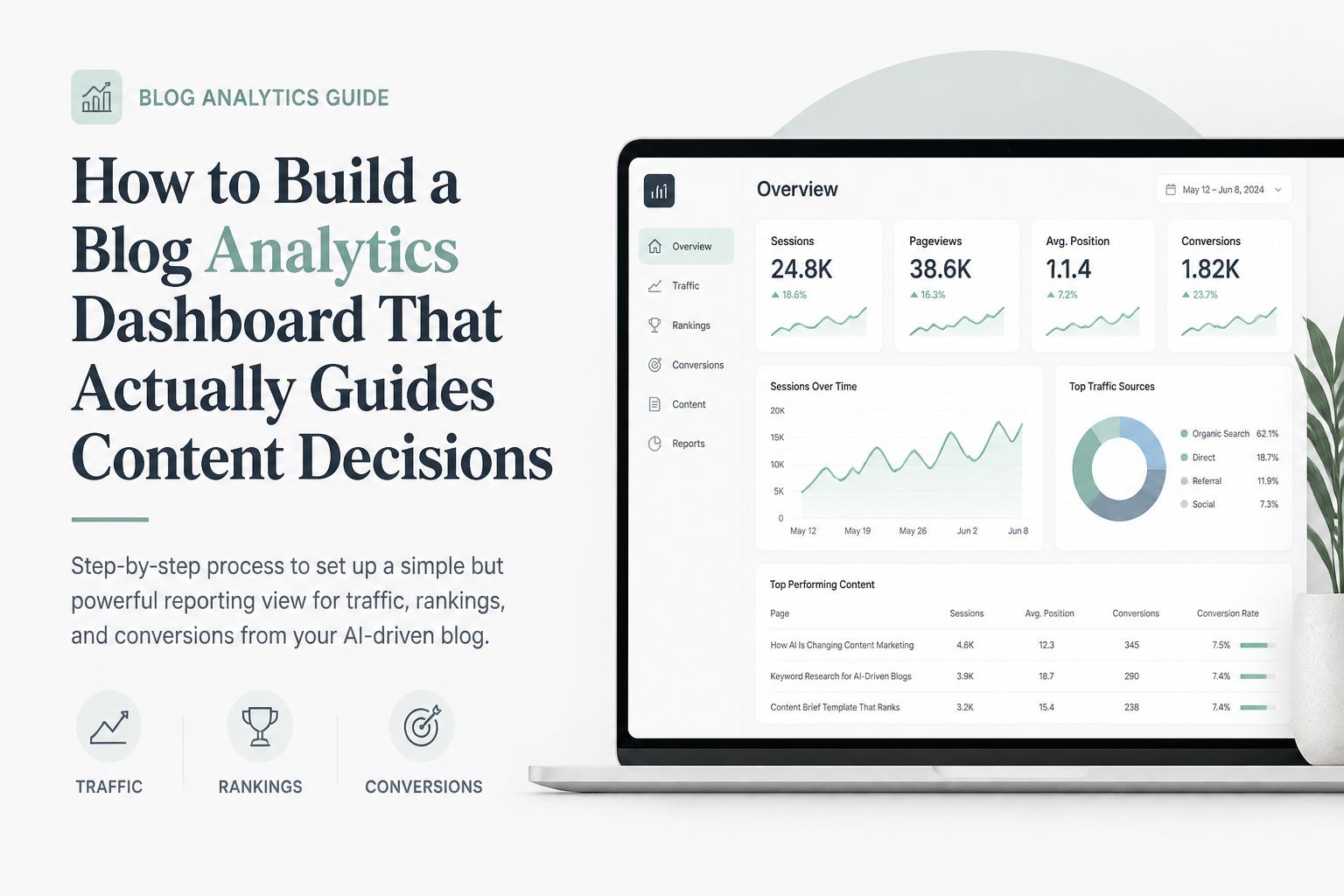
Now turn those metrics into a layout that tells a story from top to bottom. A simple structure that works well:
Row 1: Blog performance summary (last 30 days)
Row 2: Top posts by traffic and engagement
Row 3: Top posts by conversions
Row 4: SEO visibility and rankings
Row 5: Opportunities & risks (posts to update, posts losing traffic)
This mirrors how content teams naturally think: what’s happening overall, what’s working, what’s converting, and where to act.

Create a high-level snapshot so leadership and stakeholders can understand performance in seconds. Include tiles like:
Total blog sessions (last 30 days vs previous 30)
Organic search sessions to blog content
Total blog-attributed conversions
Average engagement time on blog posts
If you’re using Supablog, this top row can mirror your monthly performance overview: total organic visits, new ranking keywords, and conversions from blog CTAs.
Next, build a table that lists your top 20–50 posts with columns like:
URL / title
Sessions
Average engagement time
Scroll depth (if available)
New vs returning users
Sort this by sessions by default, but allow filters for engagement time and returning users. This helps you spot posts that may not be huge traffic drivers but are extremely sticky.
This is where your blog analytics dashboard starts driving strategy. Build a table with:
URL / title
Sessions
Primary conversions
Conversion rate
Assisted conversions (if you have this modeled)
Sort by conversions or conversion rate to see which posts punch above their weight. These are your “money pages” that deserve internal links, refreshes, and promotion.

Connect your blog traffic tracking to keyword performance. Use Search Console data to create:
A chart of total impressions and clicks for blog URLs over time
A table of top queries driving traffic to your blog
A table of top landing pages with impressions, clicks, CTR, and average position
Filter this view to show only URLs that match your blog path (e.g., /blog/) so you don’t mix in product or docs traffic.
Finally, build a section that surfaces where to act. You can create calculated fields or simple filters to show:
Risers: posts with >20% month-over-month traffic growth
Decliners: posts with >20% month-over-month traffic drop
High-CTR, low-position posts: strong resonance but not enough visibility
High-traffic, low-conversion posts: prime candidates for CTA and layout optimization
This row effectively becomes your optimization backlog. For help prioritizing which changes actually move revenue, see our guide to content attribution models for blogs.
You can apply this structure in any BI tool. Here’s how to implement it in Looker Studio, which is free and integrates natively with GA4 and GSC.
Connect your GA4 property as a data source.
Connect your Search Console site (choose both Site Impression and URL Impression tables).
Optionally, connect a CSV or Google Sheet export from your CRM with blog-attributed opportunities or revenue.
Make sure dimensions like Page path, Landing page, and Event name are available, since you’ll use them heavily.
To keep your blog analytics dashboard clean, add a filter that includes only URLs containing your blog path (e.g., Include Page path contains /blog/).
If you run multiple content hubs (e.g., /blog/, /academy/, /resources/), create separate filters or controls so you can toggle between them.
For each metric in your top row, add a Scorecard with:
Date range: last 28 or 30 days
Comparison: previous period
Filter: blog-only URLs
Use GA4 events for conversions (e.g., generate_lead, sign_up) and set them as conversion events in GA4 so they appear cleanly in Looker Studio.
For your per-post tables (Rows 2 and 3), use GA4 as the data source and configure:
Dimension: Page path + query string, or a custom field that extracts just the slug
Metrics: Sessions, Average engagement time, Conversions, Conversion rate
Filter: Include Page path contains /blog/
For your SEO tables (Row 4), switch the data source to Search Console and use:
Dimensions: Query, Page
Metrics: Impressions, Clicks, CTR, Position
Filter: Include Page contains /blog/
To visualize momentum, add:
A time series for total blog sessions, with a breakdown by default channel grouping
A time series for impressions and clicks from Search Console
A time series for blog conversions over time
Use 90-day and 180-day date ranges to see whether AI-driven publishing is compounding or plateauing.
A blog analytics dashboard is only useful if it changes what you do next week. To make that happen, define a simple operating rhythm around your dashboard.
Once a week, spend 20–30 minutes with your marketing team reviewing:
Top 5 posts by new sessions
Top 5 posts by conversions
Any posts with >20% traffic drop
From this, decide:
1–2 posts to refresh or expand
1–2 posts to promote via email or social
1–2 new posts to commission based on rising topics or queries
If you’re using an AI blogging platform like Supablog, you can feed these decisions directly into your content calendar: generate new posts around rising queries, and schedule AI rewrites for decliners.
Once a month, do a deeper review focused on strategy rather than individual posts:
Which topics or clusters are generating the most conversions?
Which acquisition channels (organic, email, paid) drive the highest-converting readers?
Which AI-generated posts are outperforming or underperforming compared to manually written ones?
Use this to reshape your content roadmap and budget. For more on turning these insights into revenue, see how to improve blog conversion rate with data-backed tweaks.
At least once a quarter, look beyond GA4 to understand how your blog influences pipeline and revenue. Connect your dashboard (or a separate view) to CRM data so you can see:
Which posts are first-touch vs last-touch vs multi-touch in closed-won deals
Average deal size influenced by blog content
Sales cycle length for leads that engaged with the blog
Our guide on content attribution models for blogs walks through practical ways to do this without a complex data team.
Many dashboards fail because only one person on the team can interpret them. To avoid that, design your blog analytics dashboard for non-analysts.
Rename technical metrics into language your team uses daily. For example:
Sessions → “Visits to this article”
Average engagement time → “Average time spent reading”
Conversions → “Signups from this article”
Impressions → “Times this page appeared in Google”
According to the Google Analytics developer documentation, GA4 metric names are flexible in reporting layers, so take advantage of that to make your dashboard more approachable.
Add a small text block near your opportunities section that explains how to interpret it, for example:
Posts in the “High traffic, low conversion” table should be prioritized for CTA testing, layout improvements, or offer changes.
You can also add conditional formatting (e.g., red for big drops, green for big gains) to make priorities obvious.
Too many filters turn a simple content performance dashboard into a playground only analysts use. Start with just:
Date range selector
Channel filter (organic vs all traffic)
Content type filter (blog, guides, case studies)
Add more only when the team consistently asks for views you can’t support with the current setup.
The final step is to make your blog analytics dashboard part of how you plan, brief, and publish content—especially if you’re scaling with AI.
From your dashboard, identify:
Topics with rising impressions but few posts → create new articles to capture demand.
Posts with high engagement but low impressions → improve SEO targeting and internal links.
Posts with strong conversion rates → create supporting content in the same cluster.
In Supablog, you can translate these directly into AI-powered content briefs and let the platform generate SEO-optimized drafts around proven topics.
Turn your opportunities section into tickets or tasks. For each high-priority post, define:
The problem (e.g., “Traffic dropped 30% in 60 days”)
The hypothesis (e.g., “Competitors updated content; we need a refresh and better internal links”)
The action (e.g., “Rewrite H2s, expand comparison section, add new CTA”)
Then use your dashboard to validate whether those changes worked over the next 4–8 weeks.
If you’re using an AI blogging platform like Supablog, you can automate several pieces of this loop:
Automatically generate and publish SEO-optimized posts based on your keyword strategy.
Use built-in blog performance analytics to see which AI-generated posts are winning.
Trigger AI rewrites for underperforming content instead of starting from scratch.
This lets your team focus on strategy and interpretation rather than manual reporting.
Even experienced marketers fall into a few traps when building dashboards for their blogs. Watch out for these:
It’s tempting to cram every available metric into your blog analytics dashboard. But more charts rarely mean better decisions. If a metric doesn’t change your roadmap, it probably doesn’t belong.
Not all conversions are equal. Use your CRM or sales feedback to understand which blog-sourced leads actually become qualified opportunities. Over time, refine your dashboard to highlight the content that produces high-quality leads, not just volume.
Organic traffic is noisy. Seasonality, algorithm updates, and one-off promotions can all skew a 7-day view. Use longer windows (28–90 days) for strategic decisions, and reserve short windows for troubleshooting.
When you scale with AI, it’s easy to think “the machine will figure it out.” But AI-generated posts still need the same measurement discipline as human-written ones. Tag or label AI-generated content in your analytics so you can compare performance and iterate intelligently.
A well-designed blog analytics dashboard is less about fancy visualizations and more about ruthless focus on decisions:
Which posts deserve more promotion and internal links?
Which topics should you double down on—or abandon?
Where can small conversion tweaks drive outsized revenue impact?
Start with the structure in this guide, wire it up with GA4 and Search Console, and then refine it based on how your team actually uses it. As you mature, you can layer in more advanced Google Analytics for blogs setups, attribution models, and automated reporting.
If you want to skip some of the manual work, Supablog combines AI-powered content generation with built-in analytics so you can see, in one place, which posts are driving traffic, rankings, and conversions—and then spin up new content to match.
From there, your blog stops being a content treadmill and becomes a predictable growth engine.
Written by
Pranjal JainFounder of Supablog, Pranjal is a software engineer passionate about building SaaS products that empower founders to grow and scale their businesses. With a strong focus on practical innovation, he creates tools that solve real-world challenges in the SaaS ecosystem. Outside of building and writing, he enjoys reading and traveling, drawing inspiration from new ideas, cultures, and experiences.